Company: Sherwin-Williams
Purdy tool selector
The redesign of Purdy’s Tool Selector aimed to improve usability, enhance competitiveness, and maintain brand consistency. A mobile-first redesign simplified interactions, improved value propositions for professionals, and integrated purchasing options. Using the SUM usability metric, we measured a significant performance increase from 58 to 96, validating the impact of the new design.
Professional painters and DIY enthusiasts often struggle to find the right tools for their specific projects. The vast array of brushes, rollers, and accessories can be overwhelming, leading to inefficiencies and suboptimal results. To solve this, I led the design of the Purdy Tool Selector, an intuitive digital experience that guides users through the selection process, ensuring they get the best tool for their needs with confidence.
Overview
Role
Lead UX Designer
skills
UX, UI, Research, Strategy,
tools
Figma, Axure RP
Research & Findings
To better understand how well the existing tool selectors (Purdy and the competitor) performed., my coworker and I set up unmoderated usability tests. After some discovered limitations of the unmoderated tests and a limited budget for recruiting participants; we ran some guerilla moderated tests with anyone we could get ahold of to better understand what users were thinking and their expectations. This proved invaluable, as we were unable to probe further with the unmoderated testing.
From both the moderated and unmoderated testing, we discovered some major issues with the existing tool selector and with the competitor’s, allowing us to make adjustments to not only improve the tool selector but also give Purdy a competitive advantage.
5 key areas for improvement
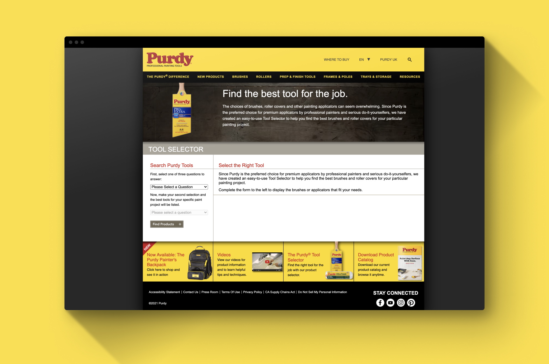
hidden Tool Selector
Users struggled to find the tool selector on the Purdy homepage, often searching in mega menus and banners.
Lack of buying Options
Users desired the ability to purchase recommended products directly or locate them in nearby stores.
Overwhelming Recommendations
Users preferred receiving 2-3 tool recommendations rather than an abundance of options.
Limited Value Prop for Pros
Professional painters typically rely on experience over research. Enhancing value propositions could better engage this audience.
vague Questions and Answers
Existing questions did not align with users’ mental-model, resulting in confusion for users when they went to answer them.

Strategy & Execution
To address these challenges, I developed a user-centric approach to simplify and personalize the selection process.
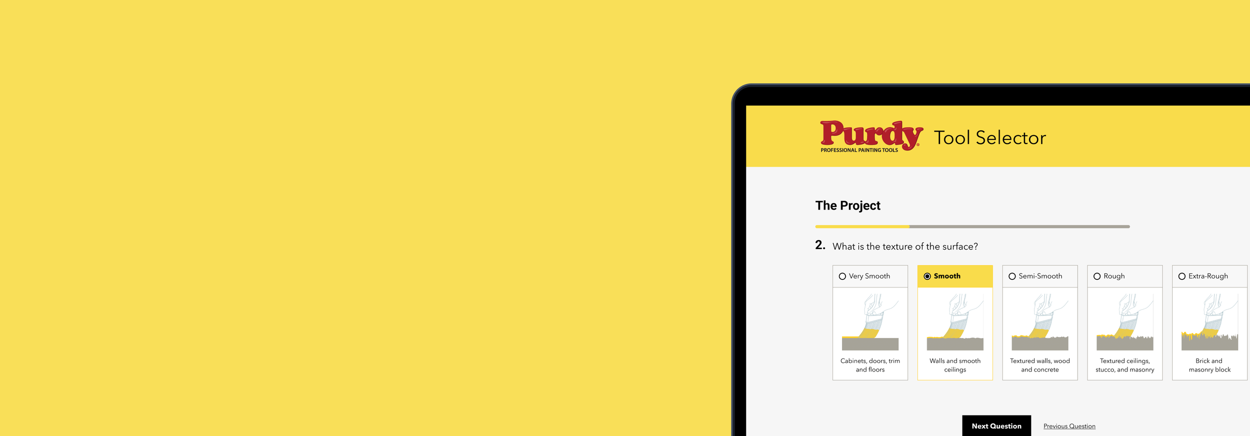
Designing an Intuitive Selection Experience
The core idea was to create a guided, decision-tree experience that walks users through a series of simple questions—about their project type, surface, paint type, and desired finish. Instead of overwhelming users with technical jargon, we distilled complex choices into an easy-to-follow flow that quickly narrows down options to the most relevant tools.
I worked closely with product managers, engineers, and Purdy’s internal experts to define the logic behind recommendations, ensuring accuracy while keeping the experience effortless. The final design featured an interactive step-by-step interface, clear product explanations, and direct links to purchase or learn more.
interactive prototype
Improvements
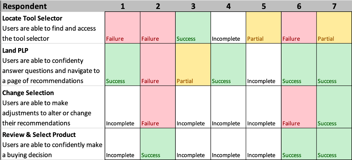
To track and ensure that we were moving the needle in the right direction, we leveraged the simple Simplest Usability Metric* or SUM to show the improvement between the existing tool selector and the redesign. Using a scorecard, we were able to calculate the overall performance of the redesign by tracking the successes, failures, partials, and incompletes* from the usability testing.
The various scores are assigned a value and a median number is an outcome used as a measure of how successful or unsuccessful users are in completing tasks. In both scorecards, the users were assigned to complete the same task and their scores were recorded appropriately.
*For a general understanding and further explanation of our approach with this metric read NNG's article — Success Rate: The Simplest Usability Metric **To ensure that the scores were comparable, the incomplete were not calculated in the median number to ensure correctness.
key results
-
The streamlined wizard pattern provided an intuitive tool selection experience, reducing decision fatigue for users and provided better product knowledge through the use of illustrations.
-
With the tool selector providing a range of tool suggestions, customer confidence and trust in purchase improved in testing. Compared to the original and competitor tool selector, the overwhelming number of options left users feeling burdended with the decision.
-
Running analysis on our unmoderated research we were able to identify a SUM score increase from 58 to 96. This improvement indicated that users were able to successfully complete more tasks in the new tool selector.
Existing Tool Selector SUM = 58
You can note the several failures and the abundance of the incompletes present in this scorecard. Although the incompletes are not calculated, they are telling of the performance of the existing tool selector.

NEW Tool Selector SUM = 96
It’s obvious given the number of successes present in this scorecard, the overall performance of the new design has been greatly improved upon.