Primary Design System
Company: Sherwin-Williams
A flexible design system for Primary, establishing a new approach for a paint manufacturing company to streamline internal tooling and product development. Built with Figma for seamless design collaboration and plain HTML for flexibility in implementation, it improves consistency, collaboration, and efficiency.
Overview
As our product suite expanded, maintaining consistency across multiple teams became increasingly challenging. Designers and engineers lacked a unified source of truth, leading to inefficiencies, inconsistencies, and redundant work. To address this, I led the creation of the Primary Design System, a scalable framework designed to unify our design language, streamline collaboration, and accelerate product development. My role spanned strategy, execution, and advocacy—ensuring adoption and long-term sustainability.
Role
Lead Product Designer
skills
UX, UI, Strategy,
tools
Photoshop, Sketch, Figma
The History
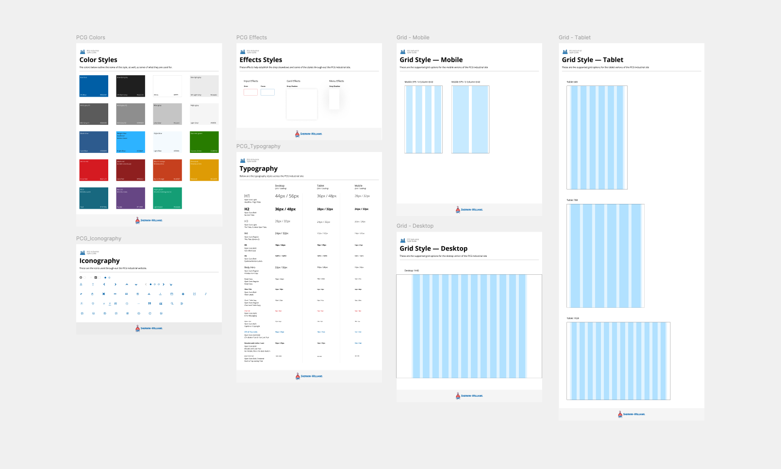
The internal design system project commenced with a significant site redesign effort for the Performance Coatings Group (PCG) division. Initially, we converted large-format Photoshop files into Sketch and Figma files. Recognizing the need for platform-agnostic solutions, we pivoted to creating plain HTML components, resulting in a comprehensive Style Guide and Component Library to support PCG's ongoing needs.
The Vanilla Pivot — Core-Web Components
In July 2019, we redirected our focus toward developing core web components. As a shared service within Sherwin-Williams' corporate sector, the UX Team engages with diverse projects across various platforms. By creating plain HTML/CSS components, we ensured compatibility across multiple products, allowing teams to apply their own branding to these 'vanilla' components.
Following an audit of existing design systems, we identified essential core web components and initiated a 'Pattern Party.' This involved conducting secondary research and documenting best practices for components such as dropdowns, buttons, text fields, and pagination. These insights informed the design and testing of seven Figma components, which were subsequently translated into React components and HTML for deployment.
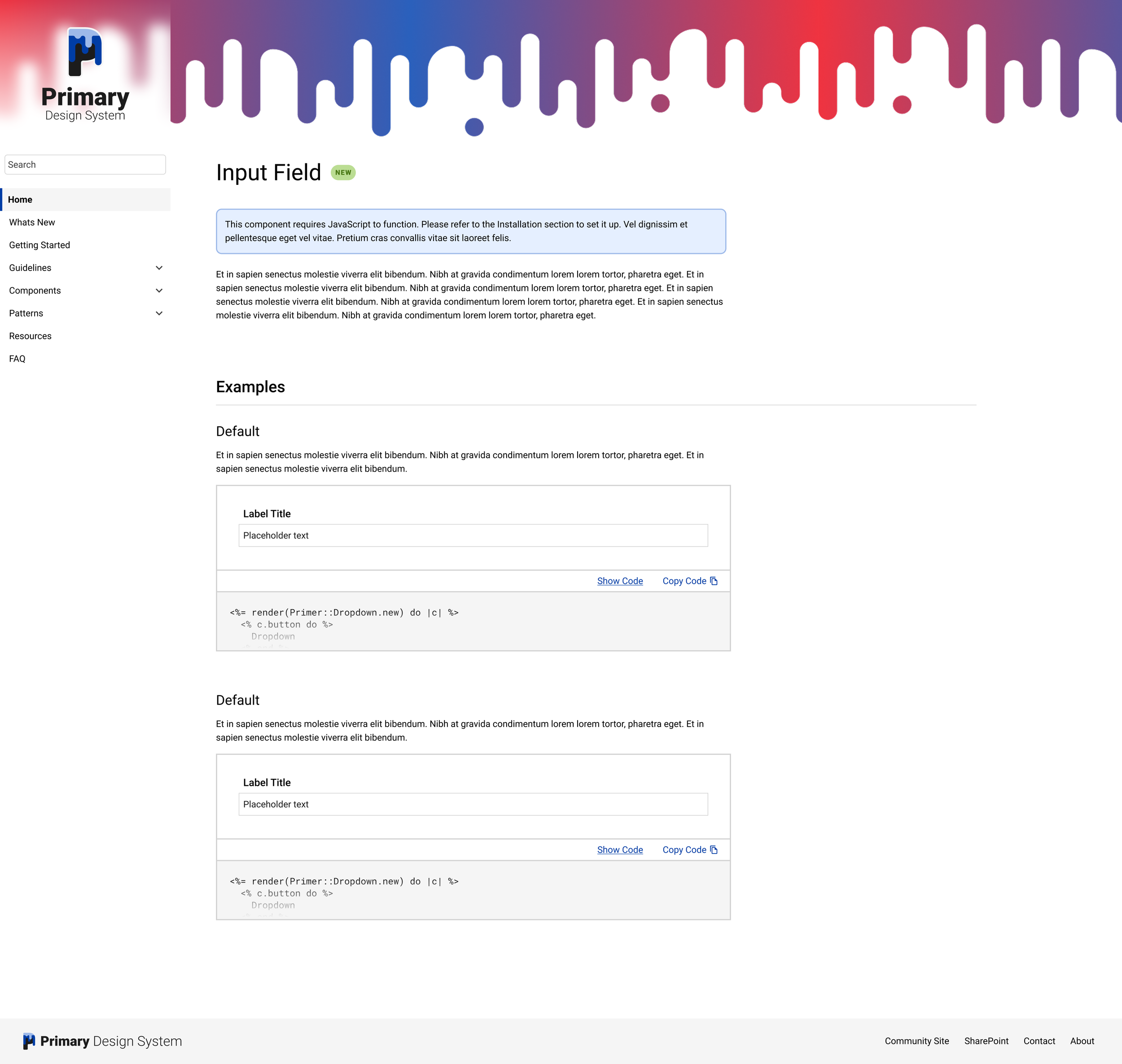
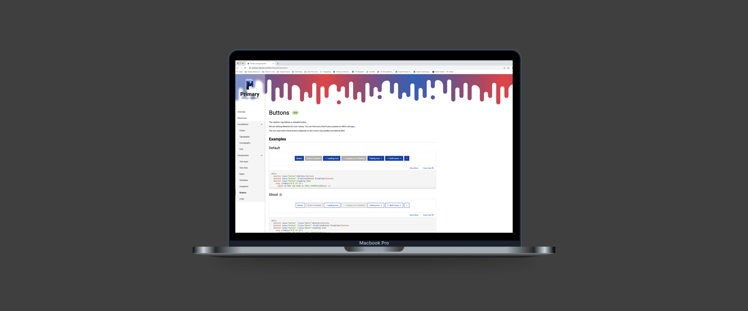
In late September, we had designed and tested 7 Figma components, based on the documentation of 6 patterns. Shortly after, a product site or reference site was designed and stood up behind the Sherwin-Williams firewall. Here, we were able to translate Figma components into React components and HTML.
In October 2021, we successfully deployed code from Primary into a pilot project, proving how components can be used in products.

Governance and Processes
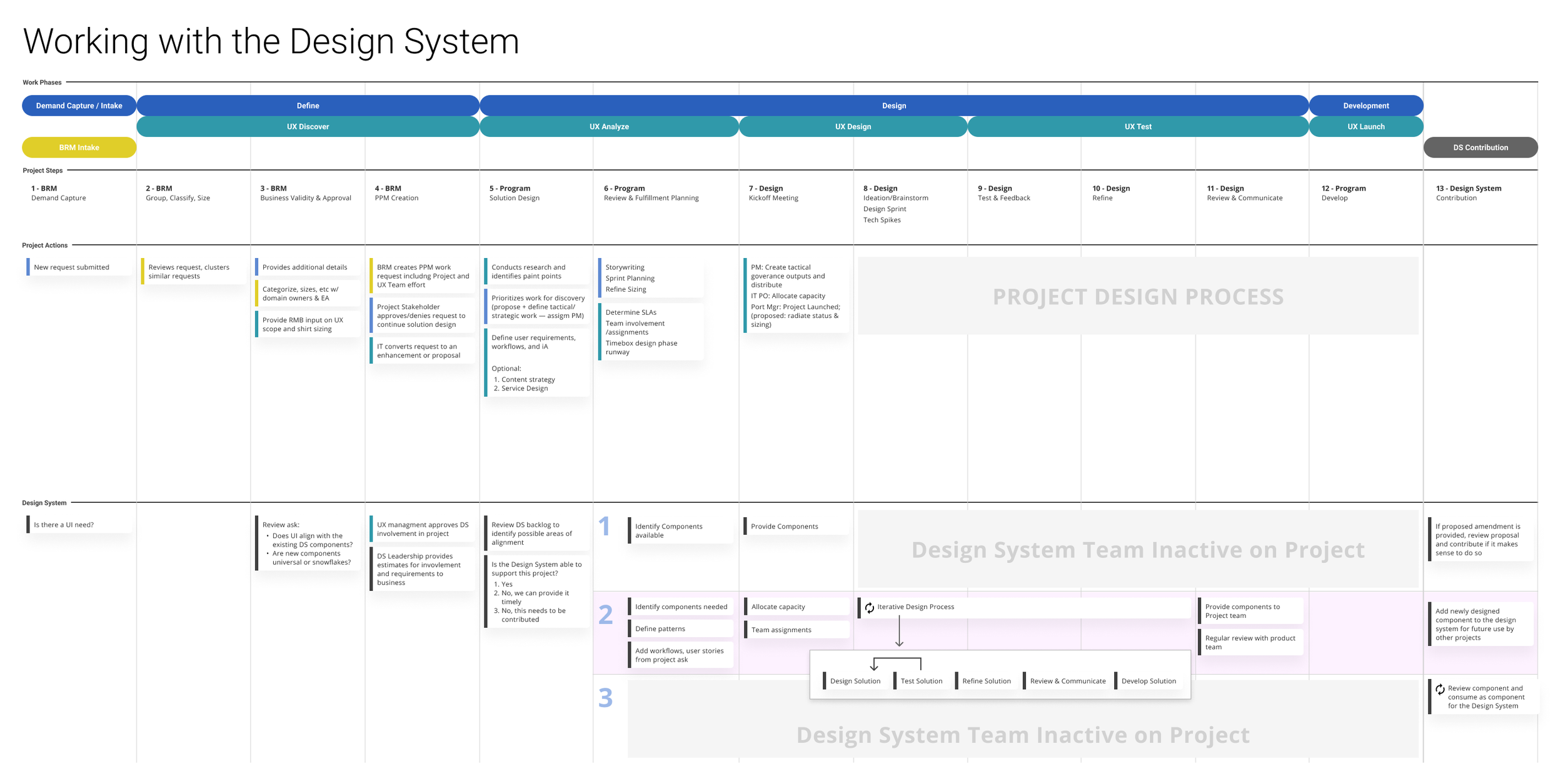
To support the design system's implementation, we developed various models and processes, including a Design System Maturity Model, a Component Consumption Model, and a collaborative workflow chart. These resources provided teams with clear guidelines for engaging with the design system and integrating components into their projects.


