Company: Sherwin-Williams
SW digital style guide
A comprehensive design system for, bridging Figma and React to unify design and development workflows, streamline component usage, and ensure consistency across platforms.
Overview
To bring greater consistency and efficiency to our design process, I developed a comprehensive style . This foundational system established a shared visual language, streamlining collaboration across teams and ensuring accessibility compliance.
Role
Sr. UX Designer
skills
UI, Research, Strategy,
tools
Figma, ColorBox.io

Key Contributions
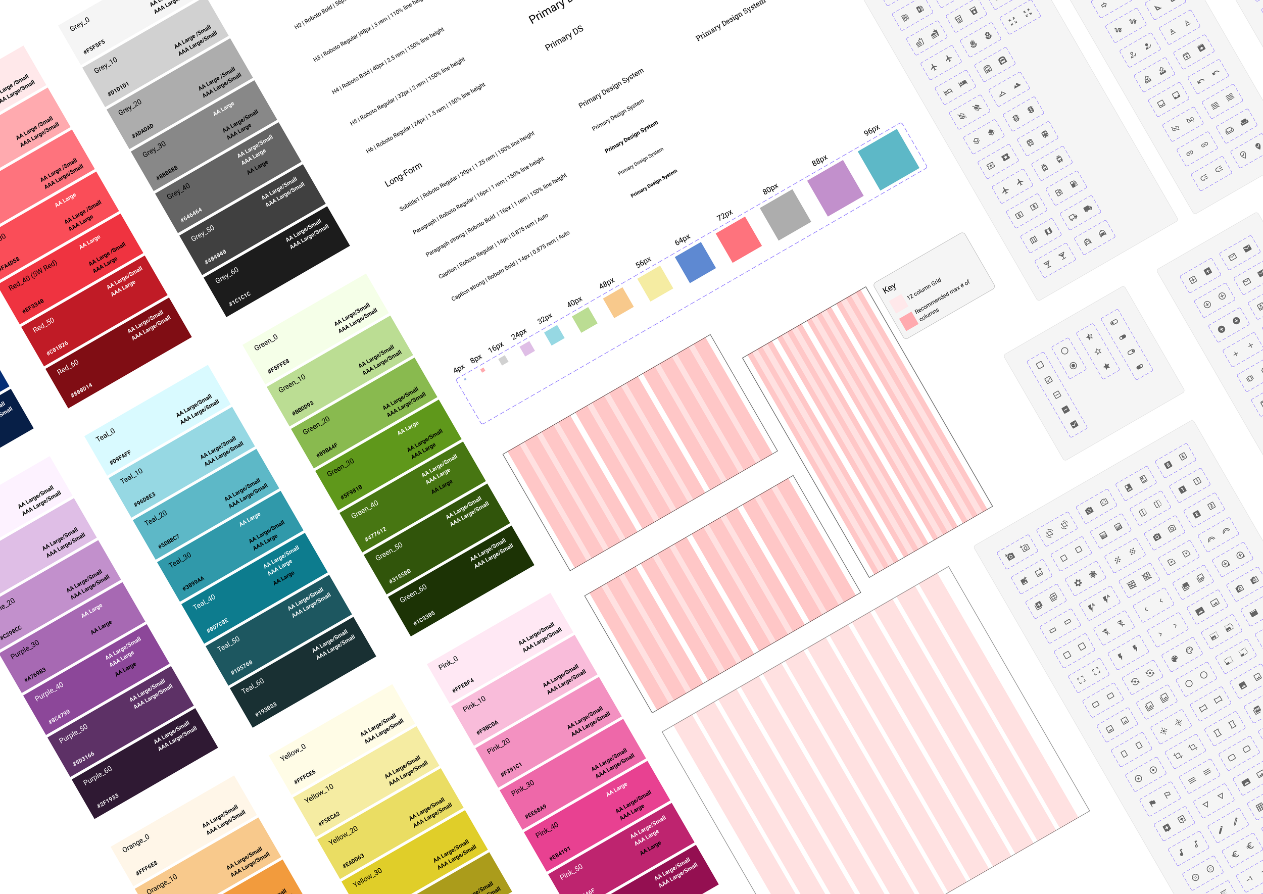
Accessible Color Palette – A structured set of nine core colors, each with seven shades, carefully annotated for AA/AAA ADA compliance.
Typography Scale – A flexible typographic system designed to accommodate various site archetypes, including Product, Marketing, and Information.
Iconography Library – Standardized icons using Material UI, ensuring visual consistency and scalability across projects.
Grid & Spacing System – Defined responsive grid styles, breakpoints, and an 8pt spacing system to maintain consistency in layouts.
Impact
By unifying color usage, typography, and iconography, this system significantly reduced inconsistencies across projects. Collaboration with Corporate Communications ensured alignment with the Sherwin-Williams Brand Guide, reinforcing a cohesive digital and print identity.
