redesigning Grafana’s Panel edit experience
Refreshing and streamlining the UI to increase ease of use and improve navigability, while bringing a modern touch to a key part of Grafana’s core experience.
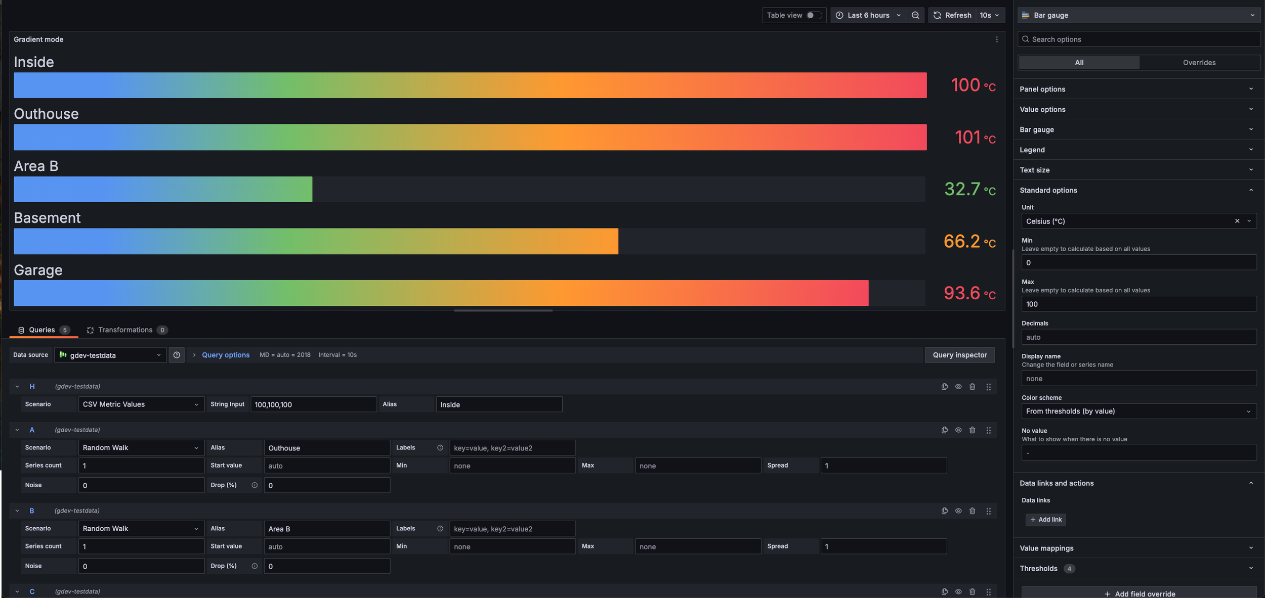
As Grafana evolved, the Panel Edit experience has remained largely unchanged, becoming harder to navigate as new features were added without a cohesive structure. Internal users (dogfooding) showed that locating elements and features that even a team was currently focused on was difficult and often resulted in a lot of scrolling up and down to locate fields. With monotonous visual elements, input fields being considerably larger than the expected length of input, and even poor copy writing for the information architecture - all led to a poor experience.
The Problem
Role
Researcher
Lead Product Designer
skills
UX, UI, Research, Strategy,
tools
In-person workshop, Figma
department alignment
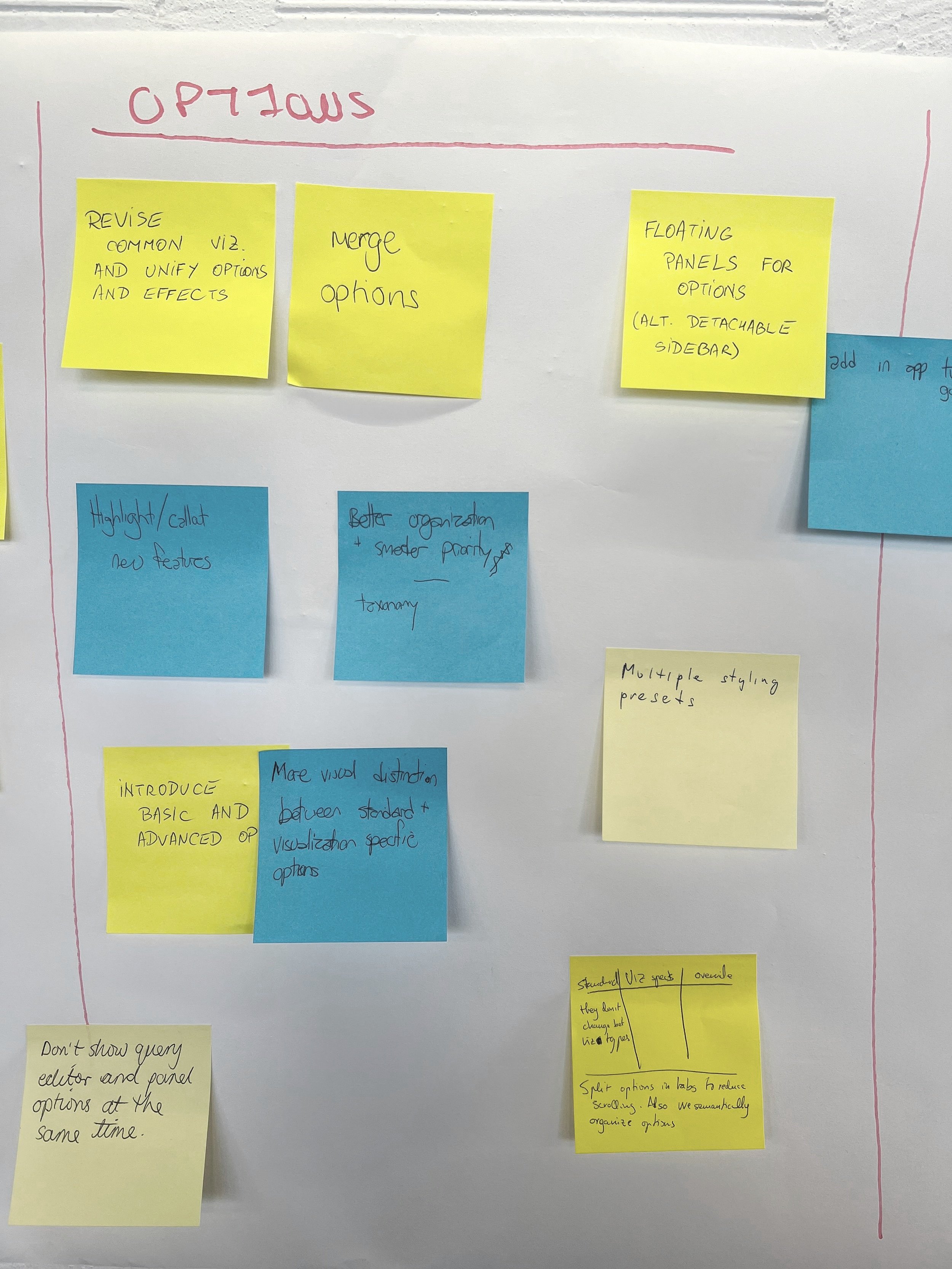
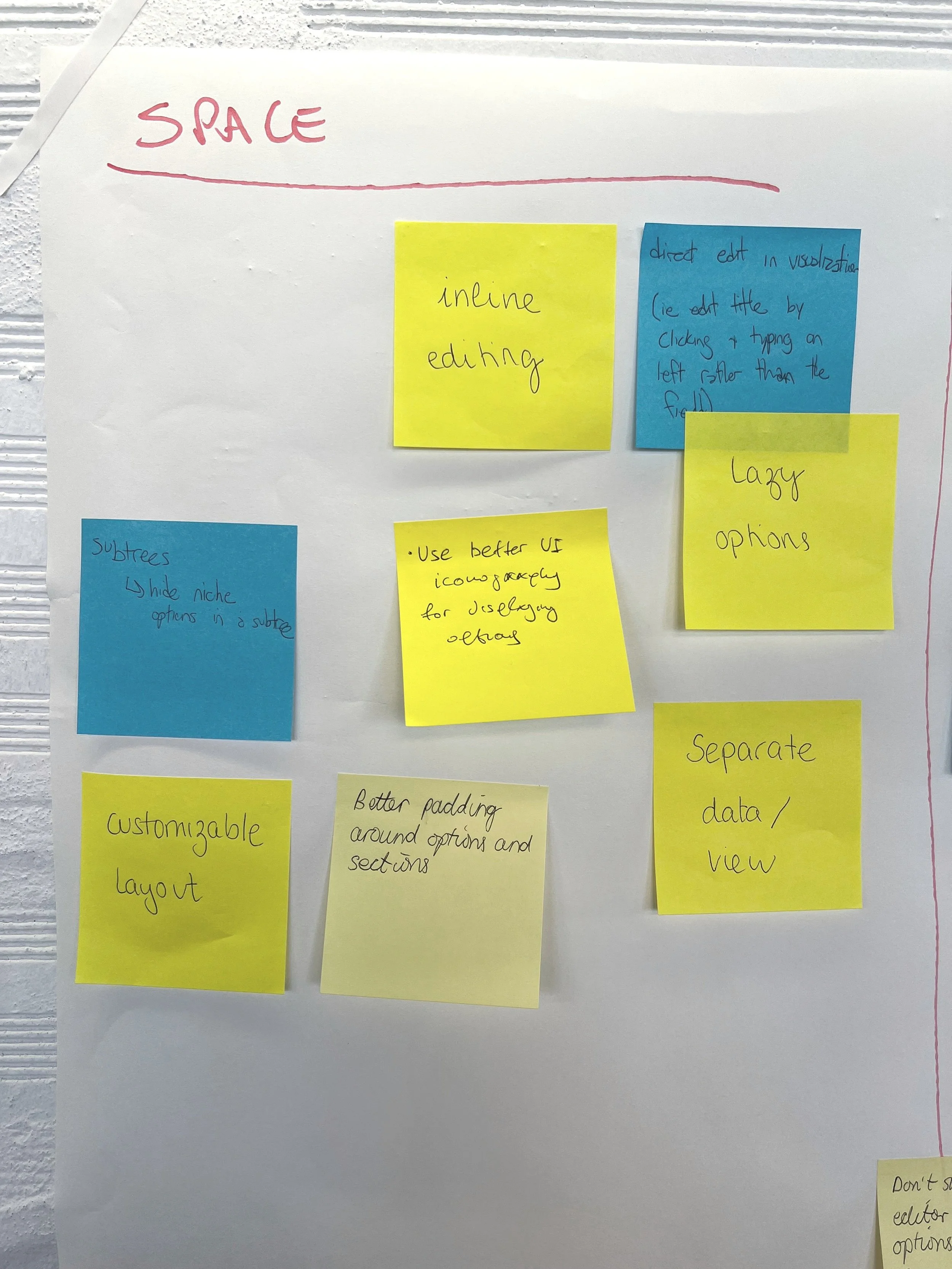
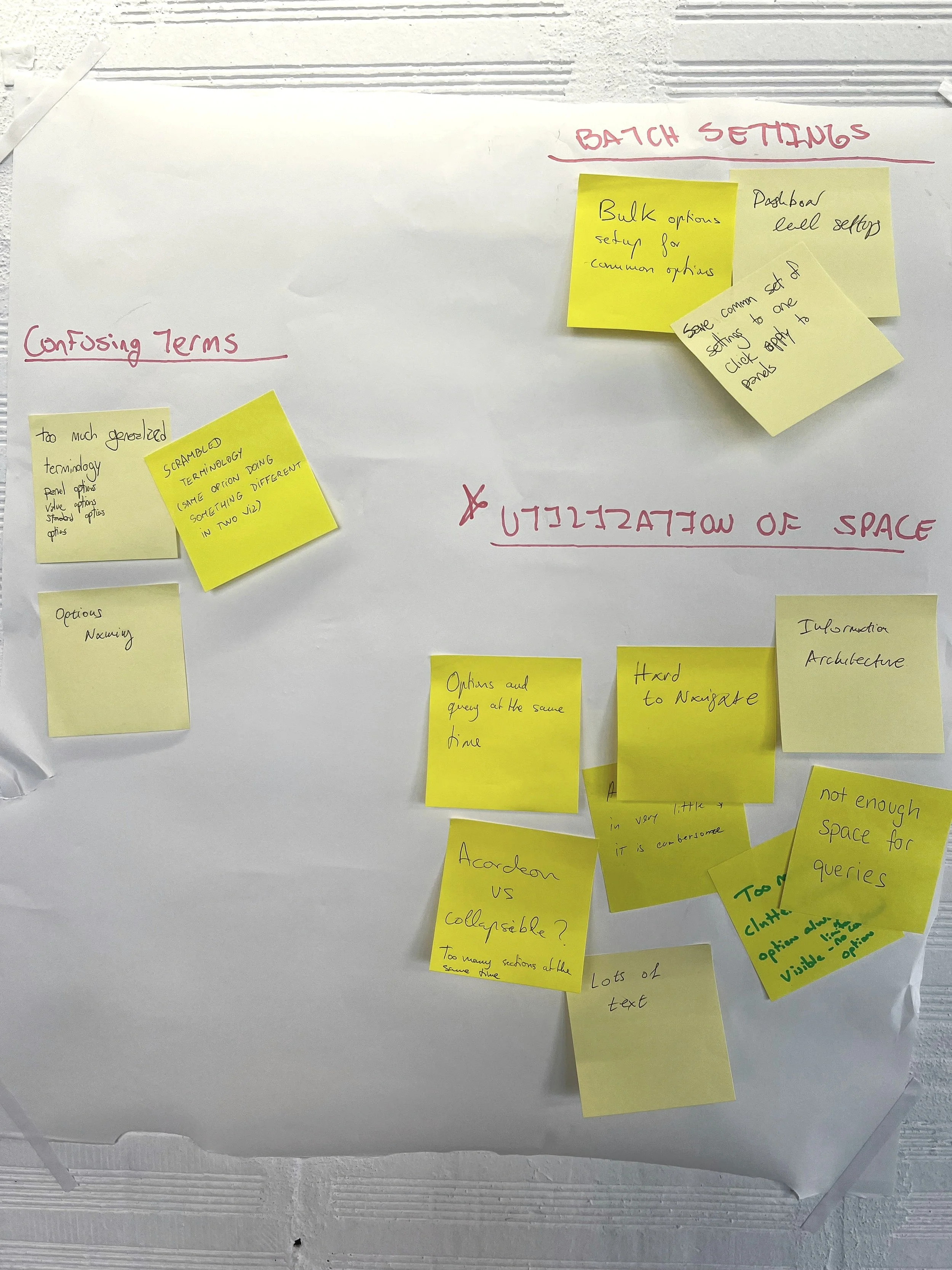
The panel edit experience at Grafana has major ownership overlap of many different development squads, all owning different parts and functionality. In order to bring alignment with all of them, it was decided to run a workshop at a team offsite. This provided opportunity for all of us to air our frustrations with the currrent UI and IA of the experience.
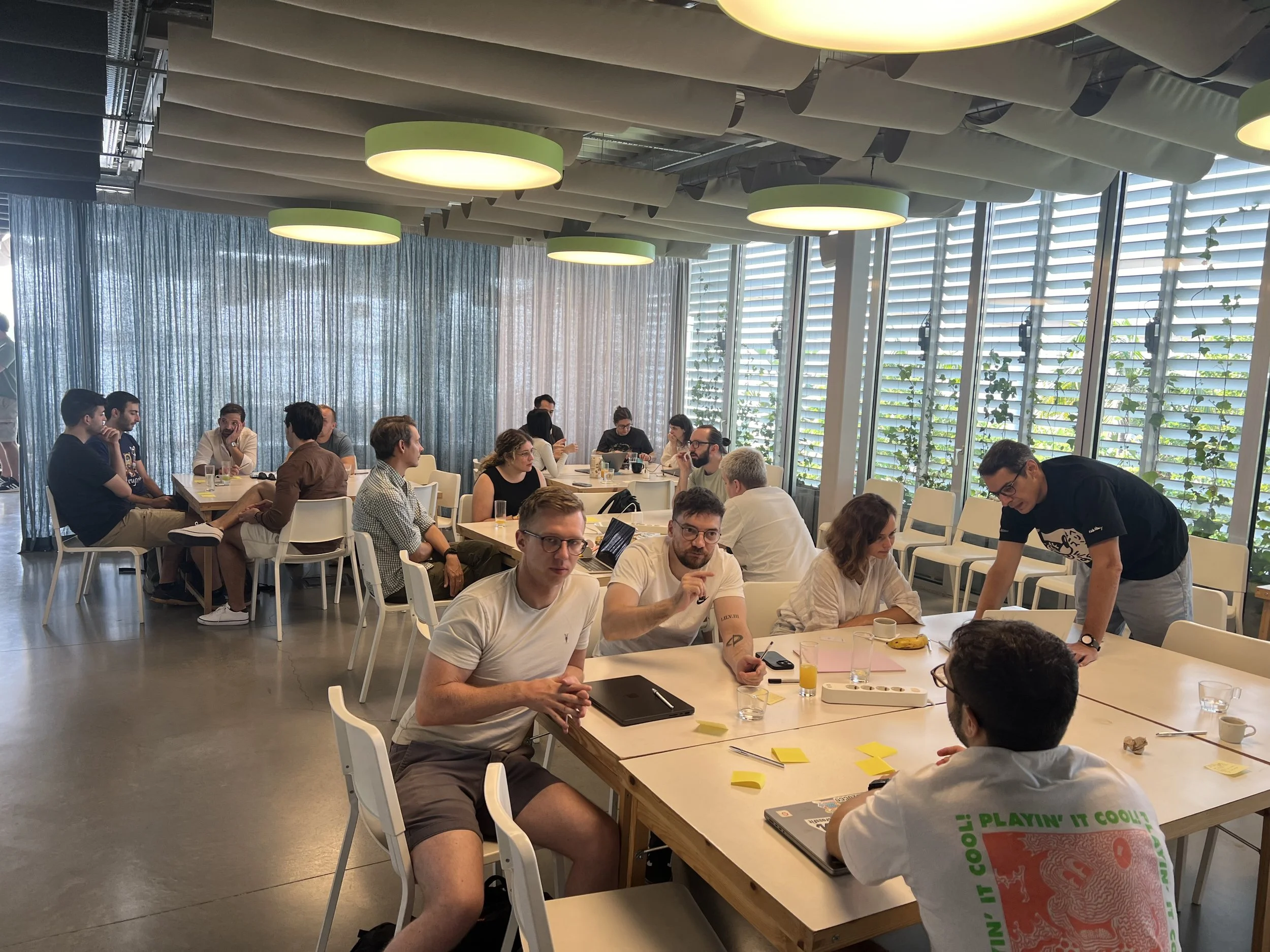
Myself and a co-worker ran the workshop of 30+ individuals, including Engineering Directors, Engineering Managers, Product Designers, Frontend Developers, and Product Managers.
Collectively, the workshop was able to gather a vast perspective of issues and areas for improvement.
Workshop & Discussions
To make the most of our workshop and time spent together, we opted for a complete analog workshop experience. Grafana is a remote-first organization and we get maybe one or two chances to connect in real life and we made sure to take advantage of it.
Working through details
The workshop was structured to be roughly 60 minutes, with planned chunks of time for group discussion and breaks. After breaking everyone into small groups and allowing time to brainstorm, I had the groups indepentally share and stick up their themes.
As each group shared, myself and a collegue actively affinity mapped the topics into large clusters to create a concise list of trouble areas. Amazingly, all the groups focused on are similar themes. After this, we discussed potential solutions and captured all of this.
design exploration
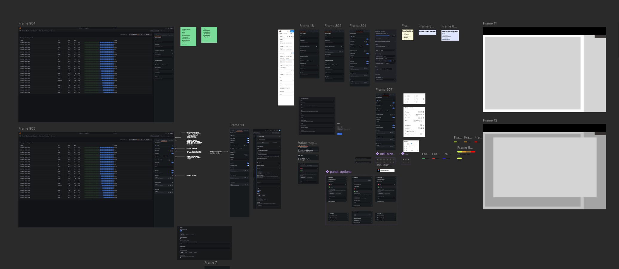
Being equipped with a general sense and strong agreement with what issues we needed to address, I began to explore possible configurations and improvements that would bring clarity, scannability, and a general sense of understanding to the UI.
Myself and a collegue pursued indepent explorations but were able to jointly land on a similar solution.
design changes
Now equipped with clear direction and a lot of feedback, the needed design adjustments were clear and the direction the experience needed to go in was no longer ambiguious.
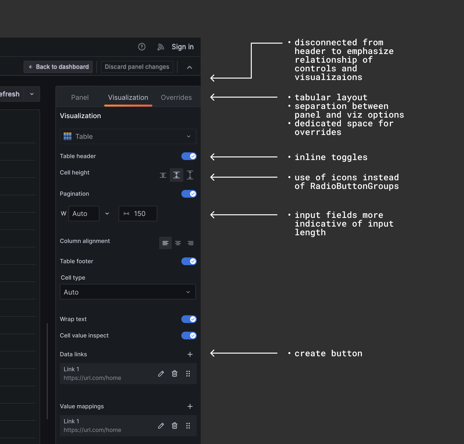
Through design iterations and improvement, a pattern was identified that allowed us to use the same number of controls, provide clarity to users around the length of expected inputs, improved the general scannability of the panel, and decreased overall length of the available options to allow users to see all or most (depending on visualization) on a single screen.
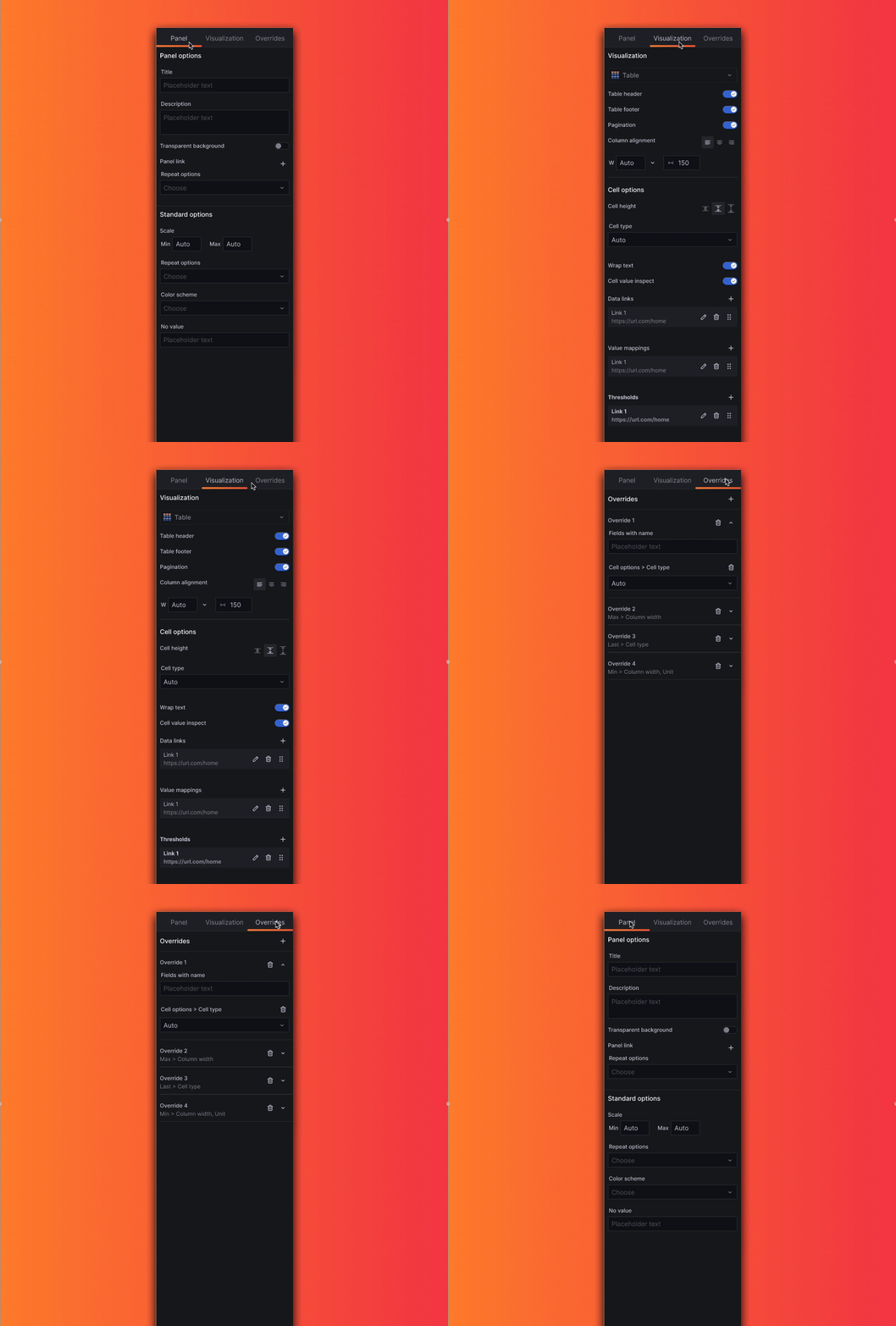
A new tabbed approach, allowed us to to break apart Panel and Visualization specific solutions, allowing users to easily find default options, while having a clear and dedicated space for the visualizations where options can change from visualization to visualization.
